Ecommerce is one of the most dynamic industries in today business world and eCommerce websites are more and more attentive and have more capability to stand steadily in the market. As we know, each year web design trends change fairly quickly. The traditional & popular trends still can exist to develop together with updating the new trends suitable in the time. And this topic is always competitive and worthy discussing in the community. Many designers renew themselves by building new trends to create an own unique style. If you are planning to change your design trend, this is the right time. Opal WordPress feels proud to share “Ecommerce Design Trends You Can’t Ignore 2015”. Hoping you can learn and choose the best one for your business.
#1.Responsive Design for Electronic Devices
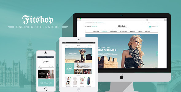
Indeed, the first trend we can’t deny is Responsive Design for Electronic Devices. This may be a important and popular trend and becomes a necessary requirement for success in Ecommerce. Simply, more and more people tend to solely use electronics devices than before. Surely they will really feel comfortable & convenient when they can see their websites fully whenever and wherever. They don’t want to spend all time for a day only using laptop or computer, sometime on street or stop red color they can access the websites on their mobile, iphone or tablet. Make sure that the website responsive on electronics devices will be used more and more popular.
Fitshop website is responsive on electronics devices
#2.Flat and Material Design
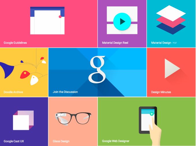
The second ecommerce trend is Flat design & Material Design. Flat design has been trending since 2014, and it continues to stir up the web landscape. The trend goes, however, towards material design. Flat design has an impressive, simple and clear style, omitting unnecessary gimmicks. Material design goes one step further by creating the right – not too exaggerated – colorful accent. A bold design with clear structures and bright colors can have beneficial effects, especially for young brands. With a new design trend, surely we will welcome the great arts from design experts. 2015 starts a year of many successes and colors.
#3.Flexible and Large Typography
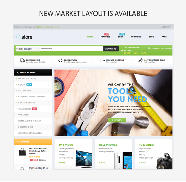
Many in the web design industry believe that 2015 could be a notable year for typography, particularly flexible and large typography that works well in the context of a responsive design. These bolder designs will also need to be managed within the context of responsive design so that the text flows well whether it is displayed on a relatively small mobile screen or on a large desktop monitor. So many ecommerce website developers are applying Flexible and Large Typography into their themes with many promises and success in 2015.
Mixstore is a specific example of flexible and large typography
#4. Hidden Navigation Menus
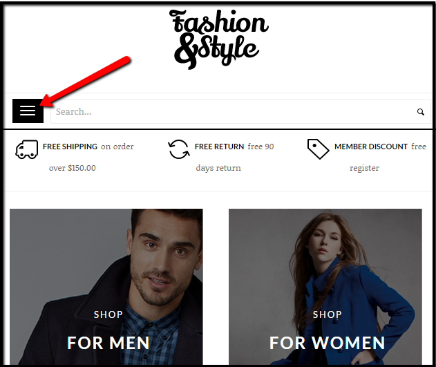
Hidden navigation has been showing up on desktop layouts quite often. Normally, they would only be seen on the mobile view of a website, but sometimes this works for eCommerce websites if they have a lot of content on their home page. Hidden navigation menus have a similar functionality to a mobile website too. In 2015, some shoppers may find that online sellers use hidden menus even when a site is viewed on a desktop or laptop with a relatively larger screen. Trendy design firms are already starting to do this. Let’s wait the interests from this new trend!
Fashion uses a hidden menu on its responsive site.
#5. Parallax Scrolling and Background Effects
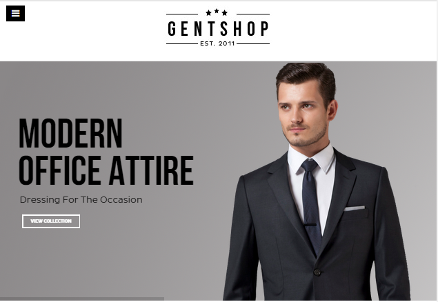
The fifth trends Opal WordPress wants to share with you is Parallax Scrolling and Background Effects. You have probably come across websites that use parallax to achieve a wow-factor. The effects can be impressive if applied correctly. However, they easily distract from what is important and should be, for this reason, implemented thoroughly and with caution. Parallax effects are only recommended if they highlight the actual content – that is your product. The flexibility of background effects also create viewers new feeling of products they are using. The website looks eye-catiching and more attentive. Surely effects recieved from customers will be increased as much as possible.
Gentshop expresses Parallax scrolling and Background Effects
#6. Micro UX/Transitions
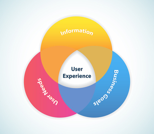
The online shopping experience should be enjoyable, but how do you make that happen? As the saying goes, the devil is in the details. Fun little features you may assume will be overlooked by the average customer actually boost the user experience and have the potential to increase click-through rates. Most micro transitions are unexpected, so the users are surprised by the animation. Great design on ecommerce websites create a friction less experience for visitors, but including micro UX effects and transitions creates a memorable impact. Implementing these elements throughout an ecommerce site adds to its personality. Hover effects on the navigation bar, such as color change and animation, enhance the online shopping experience by outlining the paths visitors take as they navigate the shop. Some ecommerce sites are including large product images with details displayed as visitors hover over the image. With this experience, surely the reputation of your ecommerce websites will stay long in customer’s hearts with the modern & unique details which only your themes have.
#7. Video Content and Backgrounds
The final trend is Video Content and Backgrounds. For years, marketing and ecommerce experts have been touting the benefits of video, including videos that help to sell products, introduce new products, tutorials and content marketing videos that help to attract customers. They feel interested and eager for each video.In 2015, look for more ecommerce businesses to use video on product detail pages, in blogs, on YouTube, and even as background images for home pages. Really video plays an important part in the success of the ecommerce websites. Many results show that the ecommerce websites with the appreance of video are more popular and profitable than others. Therefore, why don’t we apply them into the website right now?
In conclusion, Ecommerce design trends will be sure to be one of the hot topics making competition via the time. If you are planning to choose a new trend for your design style, the article of “Ecommerce Design Trends You Can’t Ignore 2015” will be ideal for you to select the best one for your style. Moreover, Opal WordPress will update the newest ecommerce design trends for you. Remember to follow our social channels such as Facebook, Twitter, Linkedin, Youtube, Pinterest to get the newest information!

